it all starts at home
〰️
it all starts at home 〰️
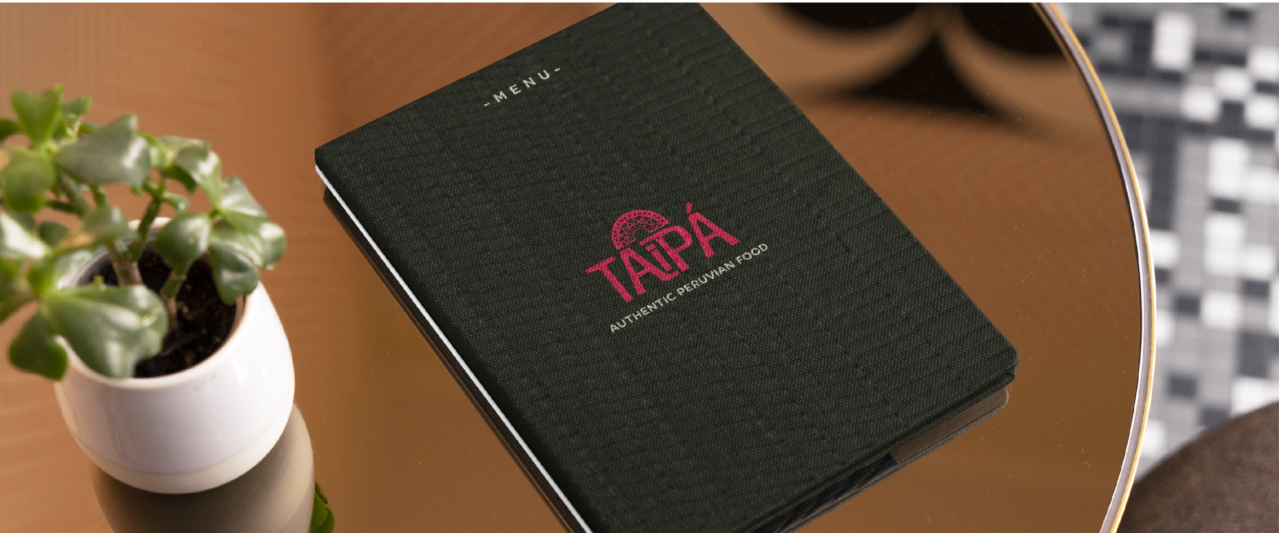
Taipá is a self-driven branding project. It is an imaginary peruvian restaurant located in Portland, OR.
TAIPÁ
This is a very personal project as a Peruvian international student living in the PNW. When looking for food that would remind me of home, I couldn’t quite find the atmosphere I wanted—it was either ‘high-end’ peruvian food or a modest food truck. This is an attempt to find an in-between. I use cultural references in the final design of the brand, but one that includes a modern twist.
Brand Identity Project

first sketches


the inca headpiece

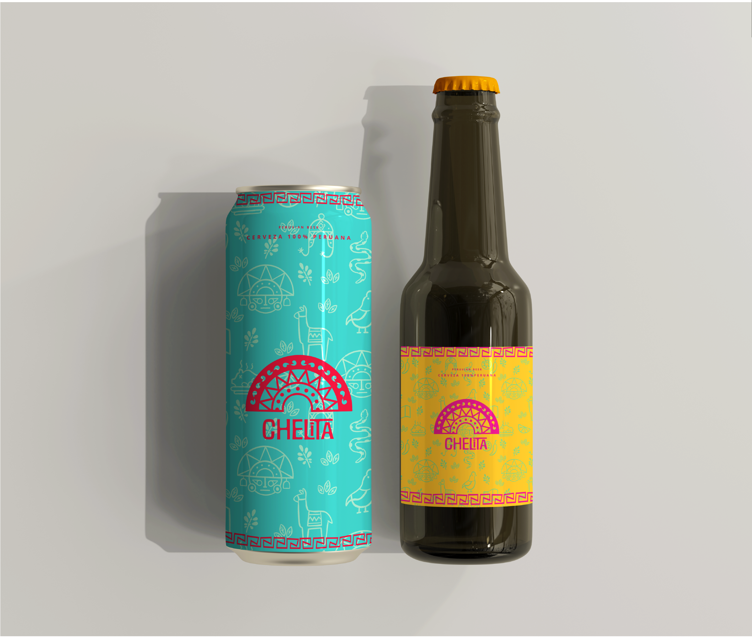
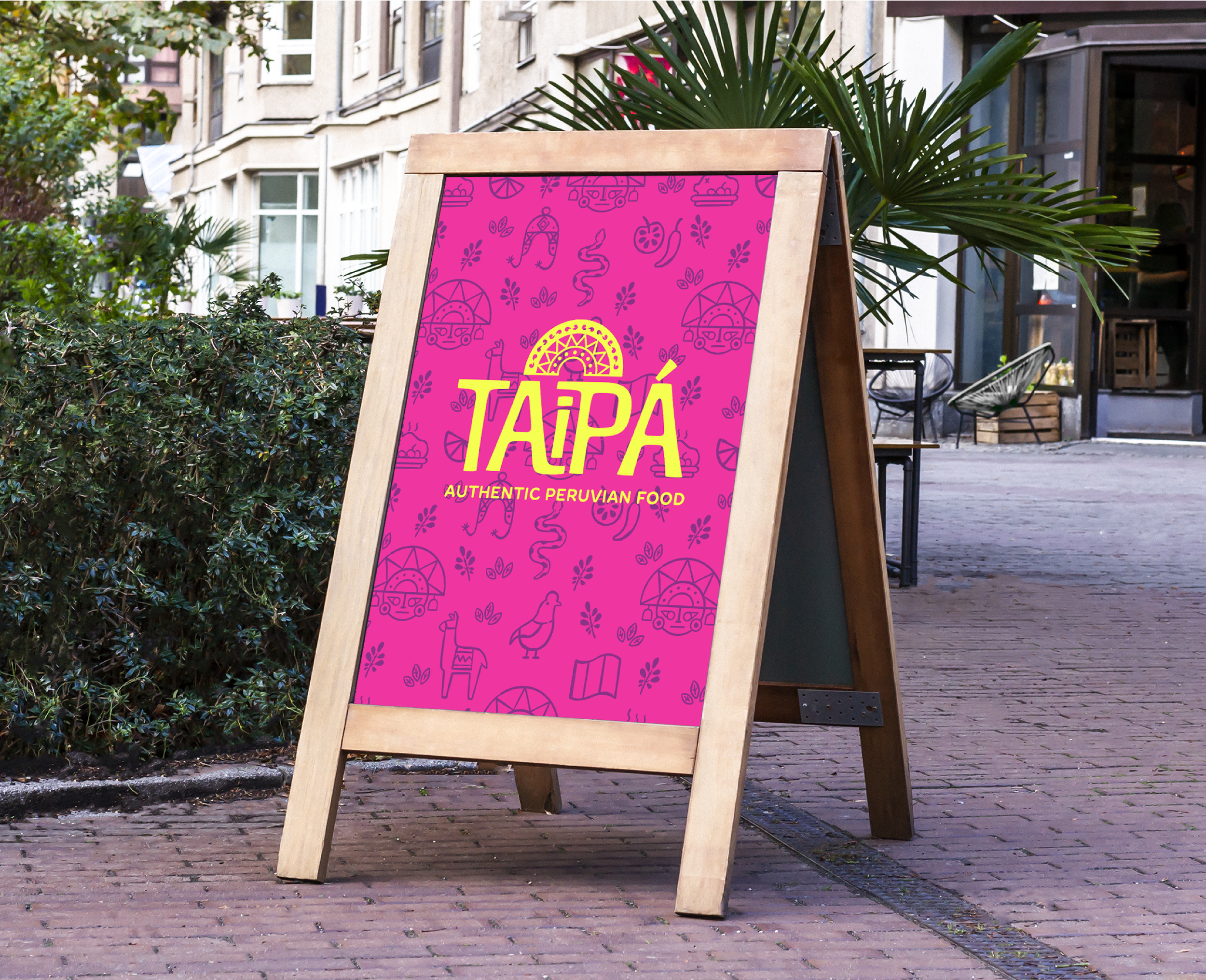
Taipá’s primary logo is an arch that references the traditional golden Inca headpiece that people in higher positions would wear. The arch is a symbol of Peru’s rich history, and alludes to the importance of honoring one’s heritage. The logo is positioned on top of the type, serving as a “crown” to the restaurant’s name.
vibe and colors
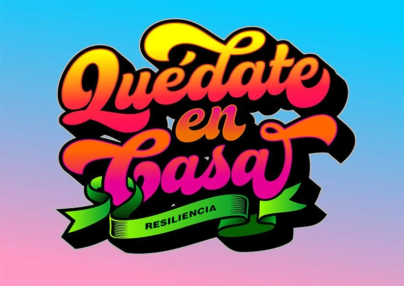


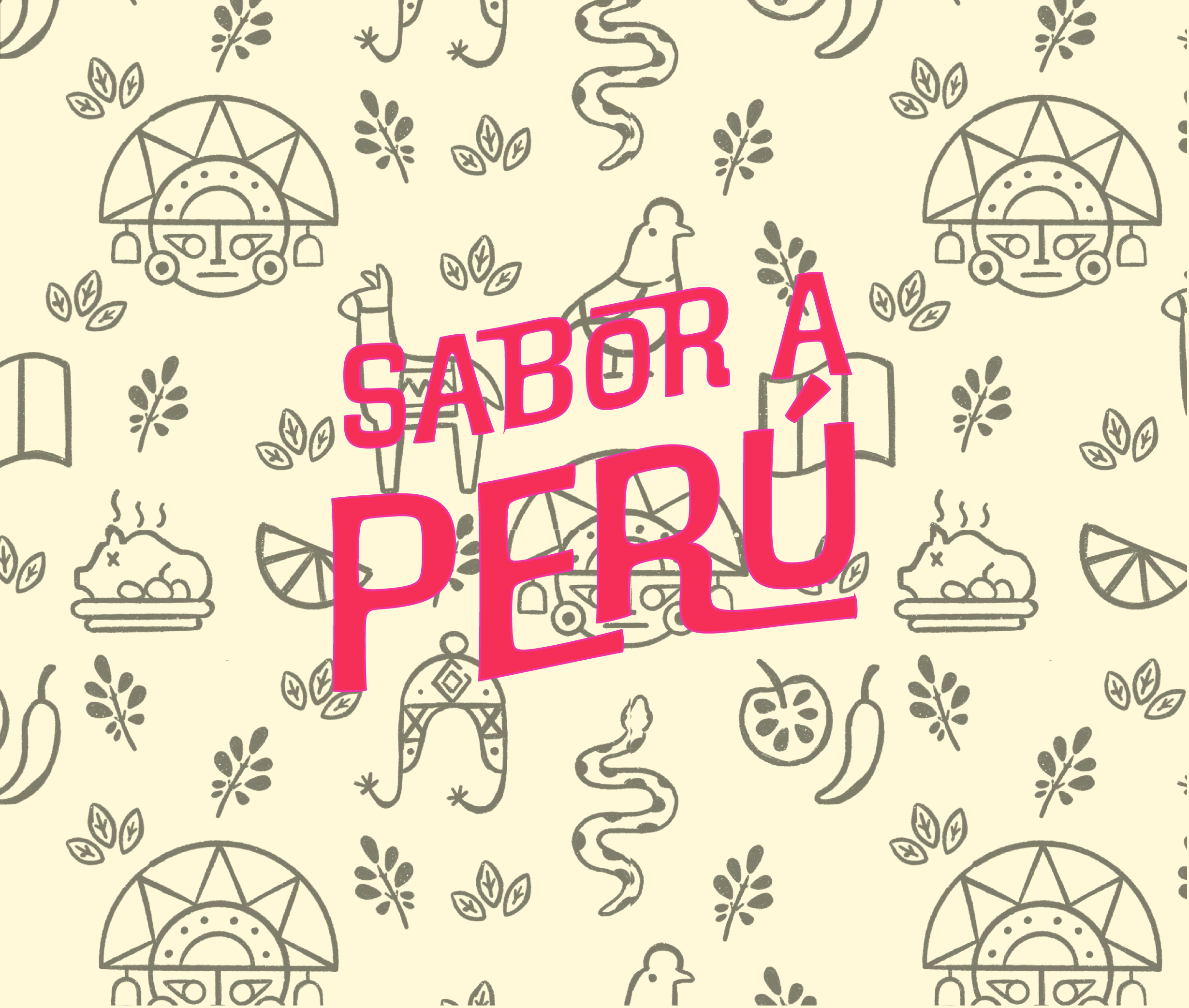
The brand’s color palette is inspired by Peru’s “Letras Chicha” which is one of the best known expressions of peruvian contemporary art, characterized by the use of letters in neon colors, printed on posters all over the city. Next to the logo, it represents the old and new culture coming together.
and this is the result



roles
Strategy
Branding
Design
Packaging
